<
Overview
Design Solution
Setbacks + Adjustments
Final Outcome
Reflection + Future Direction

RevRecruit
RevRecruit
Recruitment Service overhaul
UX Design
2 weeks
tools: figma, framer, tally forms
Overview
Overview
RevRecruit began as a recruitment service offering live coaching to help people secure work, but the model was not sustainable in a hyper-competitive job market dominated by AI-generated applications. I led a strategic pivot and redesigned RevRecruit as a streamlined UX-optimised document and application support platform focused on clarity, authenticity and conversion.
RevRecruit began as a recruitment service offering live coaching to help people secure work, but the model was not sustainable in a hyper-competitive job market dominated by AI-generated applications. I led a strategic pivot and redesigned RevRecruit as a streamlined UX-optimised document and application support platform focused on clarity, authenticity and conversion.
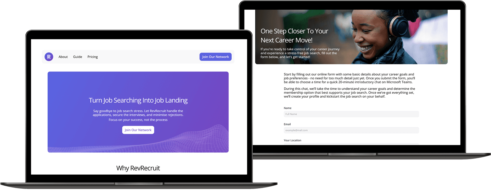
Previous Renditions of RevRecruit's website
Previous Renditions of RevRecruit's website
Client Background
Client Background
RevRecruit serves burned-out applicants and career changers who were losing momentum in the job market due to AI-generic CVs, poor ATS compatibility and decision fatigue around how to apply correctly. These users did not need “motivation” but a system that reduced friction.
RevRecruit serves burned-out applicants and career changers who were losing momentum in the job market due to AI-generic CVs, poor ATS compatibility and decision fatigue around how to apply correctly. These users did not need “motivation” but a system that reduced friction.
Core Challenge
Core Challenge
RevRecruit originally launched as a five-page recruitment coaching site with a multi-stage form and an eight-step user journey that demanded time, decision-making and synchronous human input. For burned-out job seekers, this created cognitive overload instead of relief. The model also failed to scale.
The challenge was to strip away complexity and convert RevRecruit from a “recruitment network” into a data-driven, low-effort document design service that users could complete in one sitting without friction.
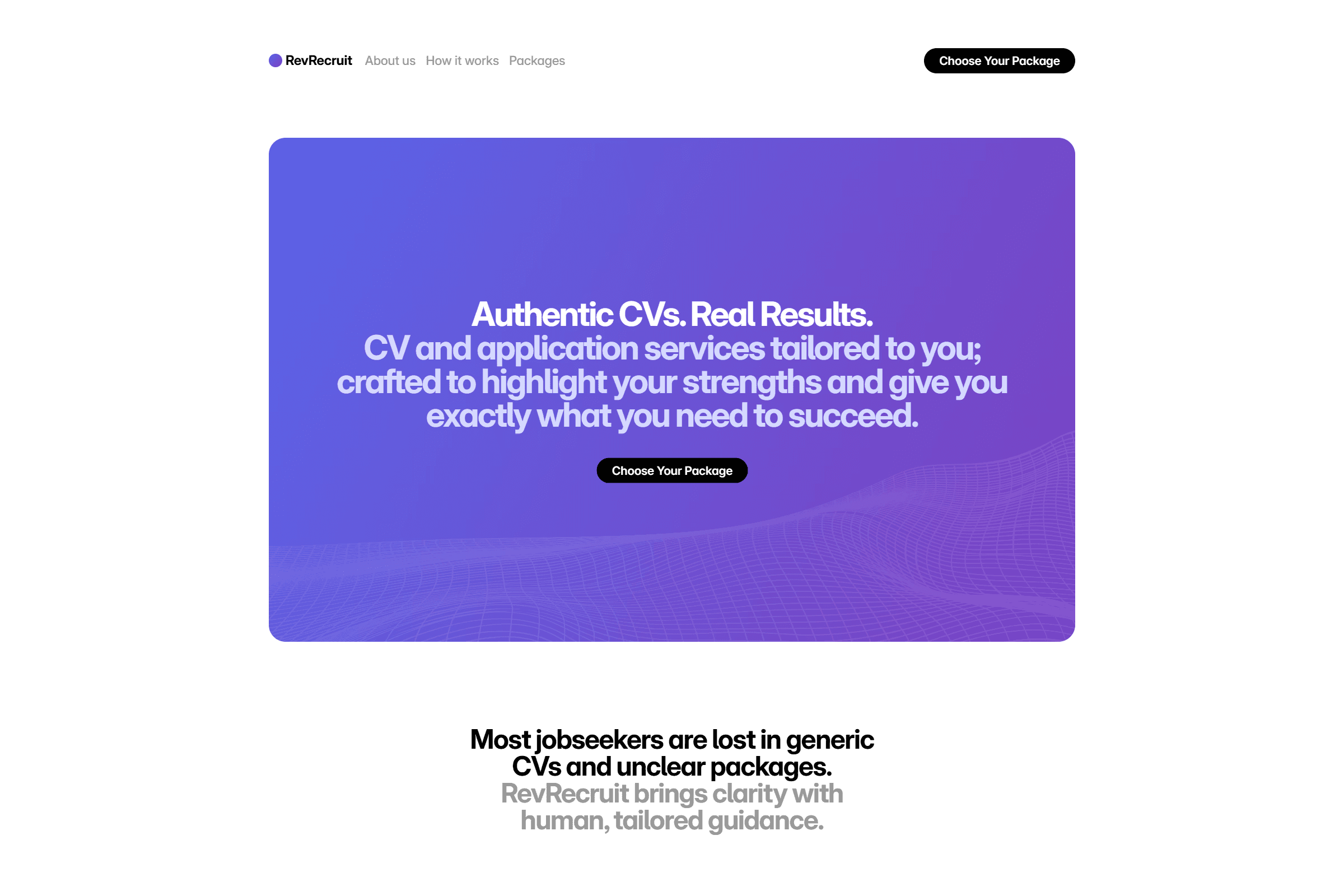
Design Solution
Design Solution
I led a full UX restructure across three layers:
1) Information Architecture (5 pages → 1 page)
Collapsed scattered pages into a single one-pager with a linear reading order:
What it is → Proof → How it works → Start now
This reduced orientation cost and sped up decision-making.
2) User Flow Reduction (8 steps → 3 steps)
I replaced the original multi-touch journey with a minimal 3-step system:
Intake → Draft → Delivery
Each step is now self-contained and communicates what happens next, removing uncertainty.
3) Intake System Redesign
The previous intake required free-text inputs and back-and-forth clarifications.
I replaced it with a structured form using conditional logic to:
• minimise typing
• request only high-signal information
• produce consistent data for writing
This turned chaotic open responses into predictable, parseable inputs and eliminated cognitive burden for the user.
4) Service Repositioning
Visually and verbally repositioned RevRecruit from a “recruitment network” into a UX-engineered, data-informed career document service, aligning expectations with the core value it actually delivered. I also recommended introducing tiered packages to reduce operational strain, make the work easier to delegate in the future, and re-establish a predictable, quantifiable revenue model instead of relying on ad-hoc coaching.
I led a full UX restructure across three layers:
1) Information Architecture (5 pages → 1 page)
Collapsed scattered pages into a single one-pager with a linear reading order:
What it is → Proof → How it works → Start now
This reduced orientation cost and sped up decision-making.
2) User Flow Reduction (8 steps → 3 steps)
I replaced the original multi-touch journey with a minimal 3-step system:
Intake → Draft → Delivery
Each step is now self-contained and communicates what happens next,
removing uncertainty.
3) Intake System Redesign
The previous intake required free-text inputs and back-and-forth clarifications.
I replaced it with a structured form using conditional logic to:
• minimise typing
• request only high-signal information
• produce consistent data for writing
This turned chaotic open responses into predictable, parseable inputs and eliminated cognitive burden for the user.
4) Service Repositioning
Visually and verbally repositioned RevRecruit from a “recruitment network” into a UX-engineered, data-informed career document service, aligning expectations with the core value it actually delivered. I also recommended introducing tiered packages to reduce operational strain, make the work easier to delegate in the future, and re-establish a predictable, quantifiable revenue model instead of relying on ad-hoc coaching.
Setbacks + Adjustments
Setbacks + Adjustments
The stakeholders initially wanted to retain their original home-built form system and workflows. The legacy approach required:
• Paying separately for form hosting, cloud storage and automation tools
• Manually sorting responses into the right service tier
• Maintaining multiple variants of the same form for each package
I suggested to replace this stack with Tally Forms because it consolidated form logic, secure file upload and payment in one platform at a lower cumulative cost and with far less maintenance overhead.
They also requested four separate forms (one for each package) which would have duplicated effort for both users and admins. Instead, I redesigned the intake using conditional logic so that a single form branches only when needed based on package selection. This removed redundancy, reduced user effort and eliminated sorting errors.
This set of adjustments shifted RevRecruit from a tool-collection problem to a single structured experience, reducing cost, risk and friction simultaneously.
The stakeholders initially wanted to retain their original home-built form system and workflows. The legacy approach required:
Paying separately for form hosting, cloud storage and automation tools
Manually sorting responses into the right tier
Maintaining multiple variants of the same form for each package
I suggested to replace this stack with Tally Forms because it consolidated form logic, secure file upload and payment in one platform at a lower cumulative cost and with far less maintenance overhead.
They also requested four separate forms (one for each package) which would have duplicated effort for both users and admins. Instead, I redesigned the intake using conditional logic so that a single form branches only when needed based on package selection. This removed redundancy, reduced user effort and eliminated sorting errors.
This set of adjustments shifted RevRecruit from a tool-collection problem to a single structured experience, reducing cost, risk and friction simultaneously.
Final Outcome
Final Outcome
RevRecruit moved from an effort-heavy recruitment model to a friction-light UX system with measurable gains:
• Information architecture cut by 80% (5 pages → 1 page)
• User flow compressed from 8 steps to 3
• Intake time reduced from ~30–40 mins to ~10–15 mins
• 800+ CVs delivered using the new flow
• 88% of users entered employment (perm or temp)
• 100% reported lowered stress and clarity of next steps
RevRecruit moved from an effort-heavy recruitment model to a friction-light UX system with measurable gains:
Information architecture cut by 80%
(5 pages → 1 page)User flow compressed from 8 steps to 3
Intake time reduced from
~30–40 mins to ~10–15 mins800+ CVs delivered using the new flow
88% of users entered employment
(perm or temp)100% reported lowered stress and clarity of
next steps
View Prototype
View Prototype
Reflection + Future Direction
Reflection + Future Direction
This project proved that most “recruitment pain” is not caused by a lack of jobs, but by cognitive overload and poor information architecture around applying. By shrinking steps, constraining inputs and removing ambiguity, hiring outcomes improved without needing more features.
The current model succeeds because it is simple and opinionated; however, there are two future opportunities from a UX perspective:
1) Turn reactive requests into proactive guidance
Instead of only delivering documents, the service could surface lightweight, data-informed prompts at key career moments (e.g. time to refresh, new sector changes, portfolio add-ons) so users stay ahead of rejection cycles.
2) Convert the manual logic into an autonomous layer
The intake patterns from 800+ users can be used to pre-generate first-pass drafts or training resources, reducing writing time and allowing the service to scale without adding people or complexity.
Rather than expanding horizontally, the evolution is about compressing user effort even further and using the data already collected to make job searching even less cognitive and more predictable.
This project proved that most “recruitment pain” is not caused by a lack of jobs, but by cognitive overload and poor information architecture around applying. By shrinking steps, constraining inputs and removing ambiguity, hiring outcomes improved without needing more features.
The current model succeeds because it is simple and opinionated; however, there are two future opportunities from a UX perspective:
1) Turn reactive requests into proactive guidance
Instead of only delivering documents, the service could surface lightweight, data-informed prompts at key career moments (e.g. time to refresh, new sector changes, portfolio add-ons) so users stay ahead of rejection cycles.
2) Convert the logic into an autonomous layer
The intake patterns from 800+ users can be used to pre-generate first-pass drafts or training resources, reducing writing time and allowing the service to scale without adding people or complexity.
Rather than expanding horizontally, the evolution is about compressing user effort even further and using the data already collected to make job searching even less cognitive and more predictable.
View My Devlog
View My Devlog
for the latest updates on upcoming projects
for the latest updates on upcoming projects